(v12.14.14)
Art, Architecture and Design
This article spotlights a particular building or some other aspect of Columbus design. I welcome your comments, corrections and additions. Please share your experience and perceptions of these uniquely Columbus projects.
 Irwin-Union Bank: downtown (now Irwin Conference Center)
- Built: 1954
- Address: 500 Washington Street
- Design Architect: Eero Saarinen (Bloomfield Hills, Michigan)
- Landscape Architect: Dan Kiley (Charlotte, Vermont)
- Addition & Renovation: 1973 & 1989
- Addition & Renovation Architect: Kevin Roche (Roche & Dinkeloo)
- National Historic Landmark (2001)
This is a building emerging from a recent transition. After the demise of Irwin-Union Bank in the midst of the economic crisis, it was acquired by First Financial Bank. First Financial decided to build a new downtown banking center and the property was purchased by Cummins Inc. Much of the adjoining building space has been converted to offices but the former bank lobby is now being used by Cummins as a conference and hospitality center as well as flexible work space when there is not a scheduled event in the building. Although the former bank lobby space has been reconfigured, Cummins has strived to maintain as much as possible of the original architecture and has left many remnants of the former banking facility in place. It is not believed that the conversion will affect the buildings status as a National Historic Landmark.
This bank building built in 1954 set new trends in bank design across the country despite the fact that Indiana banks up into the 80’s were not allowed to cross county lines. Banks in those years were genuinely local banks serving the communities where they were founded. At the time of the construction, they were looking to move away from the image of traditional banks as granite fortresses with tellers behind cages. Irwin-Union was exploring new trends in banking and in customer service and thought that innovative architecture would help them fulfill these goals.
Largely controlled by the Irwin-Sweeney Miller family, the bank was led by J.Irwin Miller who also was the top executive at Cummins Engine Company. Having become friends with Eero Saarinen during construction of the First Christian Church, Miller turned to Saarinen to design their new bank building. Miller wanted a building that would change peoples concepts of banking. Eero Saarinen’s design was a low, glass-walled building set in a grove of trees in collaboration with landscape architect Dan Kiley. The Miesian glass pavilion with its wide roof overhang may have been the first glass-walled, open floor plan bank in the country. It also contained a single drive-up window which was very rare or may have been the first in 1954. Adjacent to the banking lobby was an 3-story office wing that was tucked in behind an existing Victorian storefront along Washington Street. Although there were two glass and steel vestibule connectors leading from the banking lobby to the annex it appeared from the street to be distinctly separate. A simple brick wall on the side of the annex was all that could be seen further enhancing the main glass walled lobby building. Many never realized there was an adjacent office wing. The main building is on a very prominent corner location at 5th and Washington. It has been described as a symphony of glass, steel and concrete.
The building was framed with steel and reinforced concrete. A special brick which was later named “Columbus Bank Special” (CBS) consisting of 8-10 color variations was developed especially for this project. Main building materials used were glass, poured concrete, steel and wood. Inside the building, 8-inch round steel columns were arranged in nine square bays to support the concrete slab roof. Ceilings are plaster. Flooring in the lobby and corridors was a 1 inch thick glazed, split paving brick in a rustic buff color to hold up to heavy traffic flow and to make customers feel comfortable walking into the building whether they were coming from a factory, a farm or an office. Window coverings were continuous, floor-to-ceiling reed blinds selected by Saarinen.
9 shallow domes on top of the building provide a relief from the low flat roof as well holding the suspended ceiling lights on the interior. The domes appear as sculptural forms on the exterior and from the inside as volumes of light. From an aerial view, they add a distinctive geometric “roofscape” to the building. The large lightweight domes are centered on the 9 square column bays reducing the weight of the concrete slab roof making its slender cross section possible. The white domes are open on the inside coated with a white fibrous acoustical coating acting as a reflector for the lighting suspended in the middle. One of the drawbacks of the domes was that they were quickly discovered to be sound reflectors as well. A private conversation being held underneath one of the domes could sometimes be heard very distinctly under another. The staff had to position themselves carefully to avoid this “feature” from violating a customers privacy.
The lobby interior was a large open space meant to provoke a friendly, open feeling. The building was designed to distance this bank from traditional banking architecture which were mostly imposing, neoclassical style buildings of brick or stone. Tellers were behind iron bars and removed from their customers. Saarinen worked with Miller to develop a building that would welcome customers rather than intimidate them. There was a deliberate lack of partitions and offices. Miller said that he wanted customers to see what the bank was doing with their money. Original furniture was from the Herman Miller company with side chairs designed by Saarinen. Much of the original main banking lobby furnishings remained in place during its history as a bank. Desks were adapted to accommodate modern electronics. Other furnishings were added to replace or enhance the originals. The original teller stations used panels of primary colors which were later changed to more neutral tones. Despite the changes and additions over the years, the bank strived to maintain the original interior and exterior look as much as possible. Alexander Girard provided artwork throughout the building. Girard later worked with Saarinen in Columbus on the Miller House, North Christian Church and his own offices at 301 Washington.
A prominent feature of the center bay is a stairway to the lower level containing the vault, safety deposit boxes, a boardroom/community meeting room and other banking functions. The stairs have white oak treads with open risers, rectangular walnut handrails and guardrails/balusters of machined satin-finish stainless steel. Bar stock is used for the top rails and rod for the verticals. The stairway is partially suspended by the closely spaced vertical rods and reminds many of the pair of suspended stairways at Saarinen’s GM Technical Center in Detroit which was built a few years after this project was completed.
Kevin Roche had been Eero Saarinen’s assistant during design and construction of the original bank. A 1973 Kevin Roche addition used a 3-story glass arcade to link the banking lobby to the original office annex and to Roche’s own office addition to the rear of the annex. The arcade uses redwood planters to hold trees and seasonal plants. The arcade was also originally intended as a public space to move pedestrians from Washington to Jackson Street. It was hoped that pedestrians would flow through the space to the post office that Roche had designed several years earlier at 5th and Jackson and then into the new Courthouse Mall adjacent to the post office.
Roche’s arcade incorporated a striped glass laminate meant to help moderate the heat from the sun in the space. The arcade with alternating stripes of reflective green mylar and clear glass gave the space the look of a greenhouse and provided interesting patterns as the sun moved over the building in the course of a day. Warm air from this space is recirculated to help heat the rest of the building. The Roche addition had a solar collector to help in heating the building which was a very advanced feature at the time. Many of these early energy saving features were continued in the nearby Cummins HQ building that Roche designed in 1983. Much of the Roche advanced technology can be attributed to Roche’s partner John Dinkeloo who was both an architect and engineer. Roche’s addition kept the floors column free by using load bearing structural cores containing stairs, elevators and restrooms at either end with structural steel columns around the outer walls. Ceiling air ducts and grid work with lighting are other features integrated into the design which allowed a three story building that was no higher than the other two story buildings nearby. After Cummins took over the building they replaced the striped laminated glass in the arcade with fritted glass resembling the original but much more energy efficient.
Another addition and renovation in 1989, also by Kevin Roche was a restoration of the front facades of several historic storefronts originally designed by Charles F. Sparrell at 518-524 Washington to the right of the main banking pavilion. The interiors were renovated as additional office space. These additions was also linked to the glass arcade.
Dan Kiley’s original landscaping surround the main banking lobby with trees in what Saarinen called an “office in a garden”. The tree’s were enhanced by seasonal blooming plants. A large grove of linden trees were originally planted in a grid behind the lobby building. As originally configured there was one drive-up window at the rear of the lobby building. As the drive-up lanes were increased, they ended up removing most of the trees in the center of the grid leaving trees around the outside. Honey Locust trees have replaced the lindens.
The building was designated as a National Historic Landmark in 2001 for its innovative and trend setting architecture.
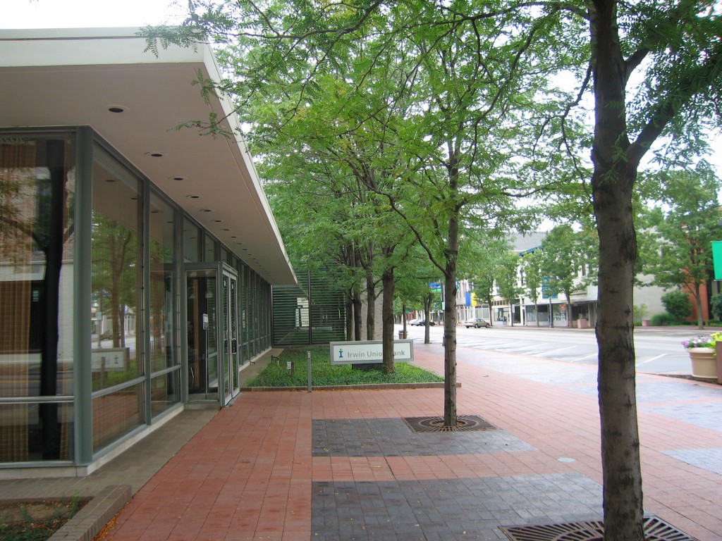 Front facade, surrounded by trees
(photo by Ricky Berkey)
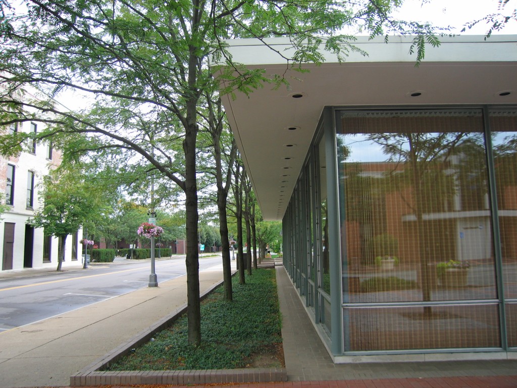 5th Street side, surrounded by trees
(photo by Ricky Berkey)
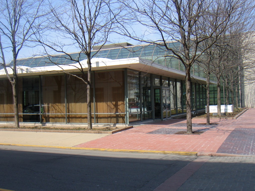 Saarinen building in foreground, Roche addition behind
(photo by Ricky Berkey)
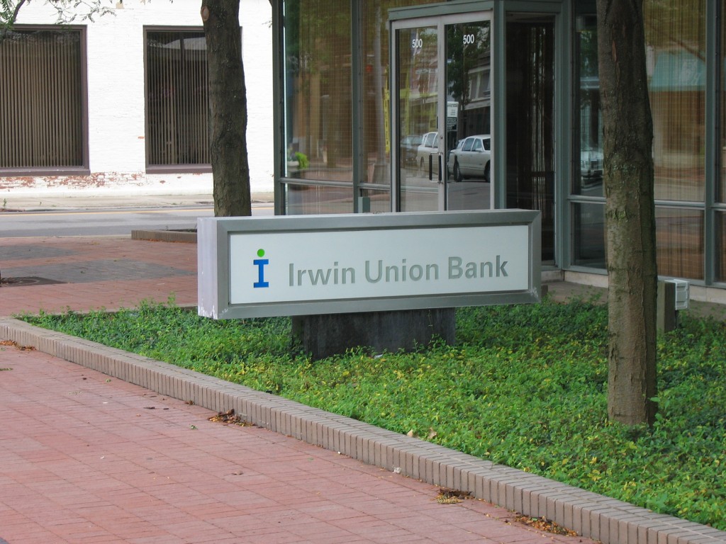 Sadly, the Irwin-Union Bank name has become part of Columbus history
(photo by Ricky Berkey)
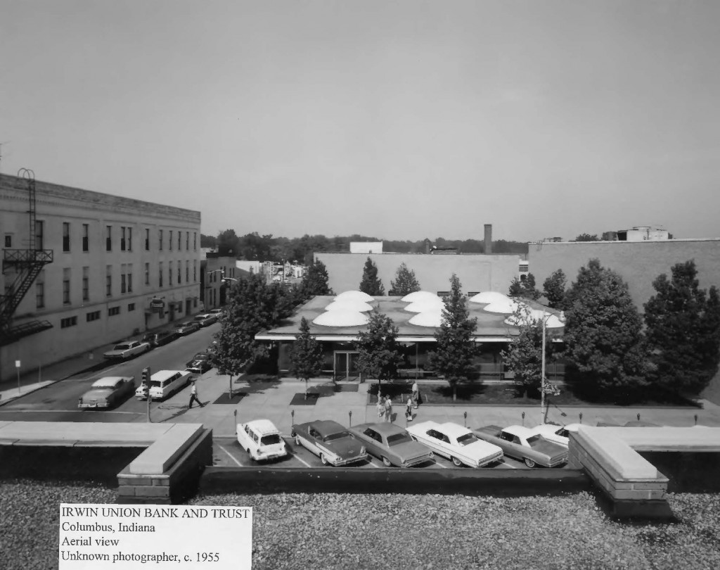 Rooftop picture from 1955
(photo used pending permission)
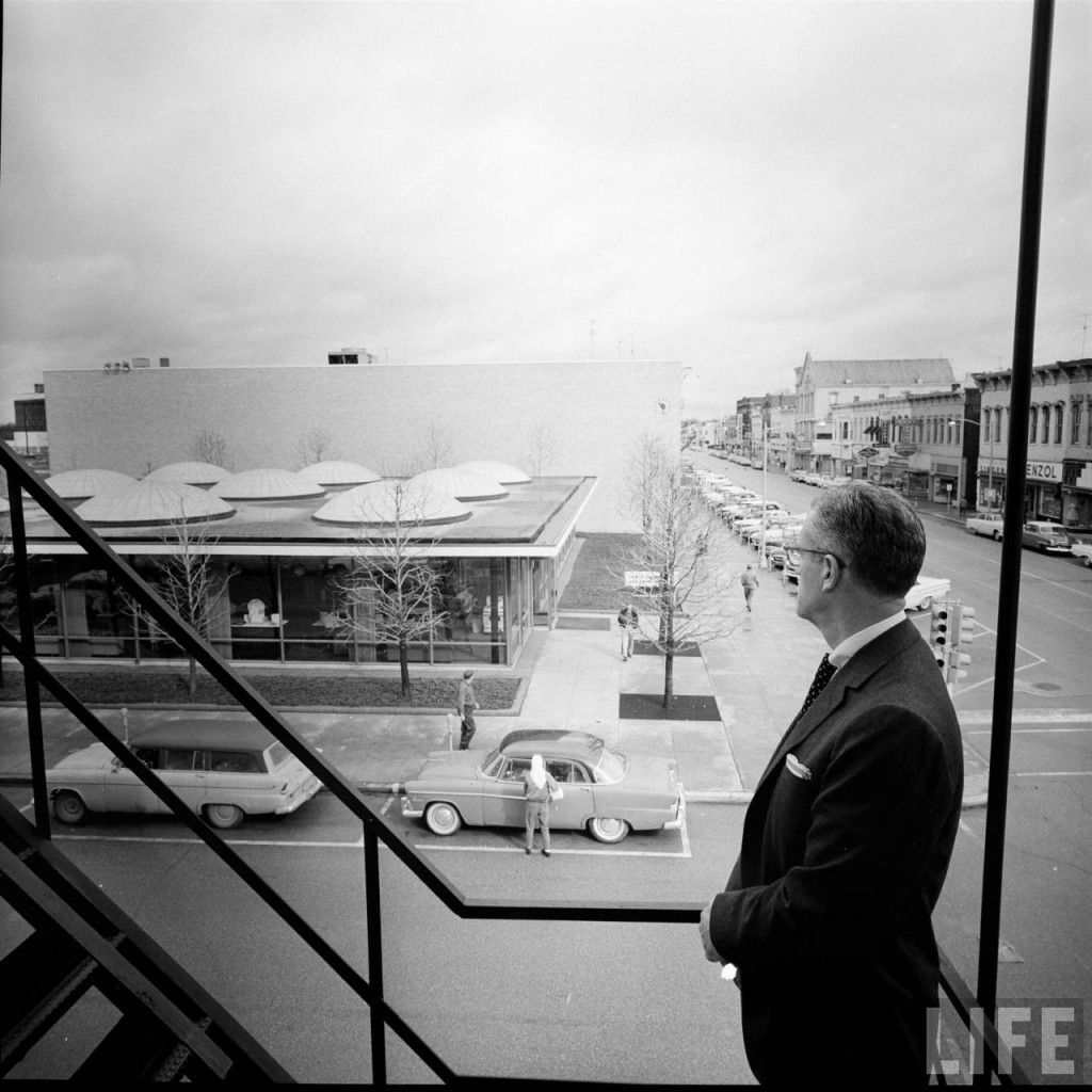 1961 view of J. Irwin Miller from the fire escape of the St. Denis Hotel building which had been the former home of the Irwin-Union Bank as well as a former Cummins HQ location
(photo by Frank Scherschel from the Life photo archive – used pending permission)
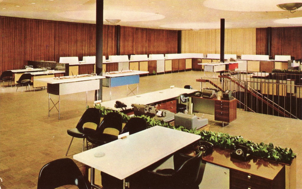 Early view of the interior with the original color scheme which was later somewhat subdued.
(postcard image used pending permission)
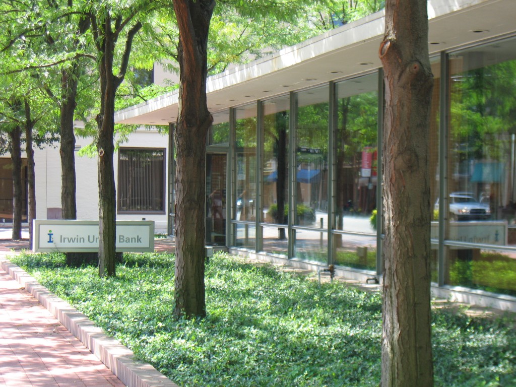 Front facade along Washington Street
(photo by Ricky Berkey)
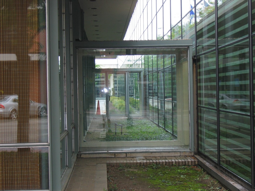 These two vestibules were the original connection to the Saarinen office annex before the Roche addition, the space where the glass arcade is now was then a row of trees
(photo by Ricky Berkey)
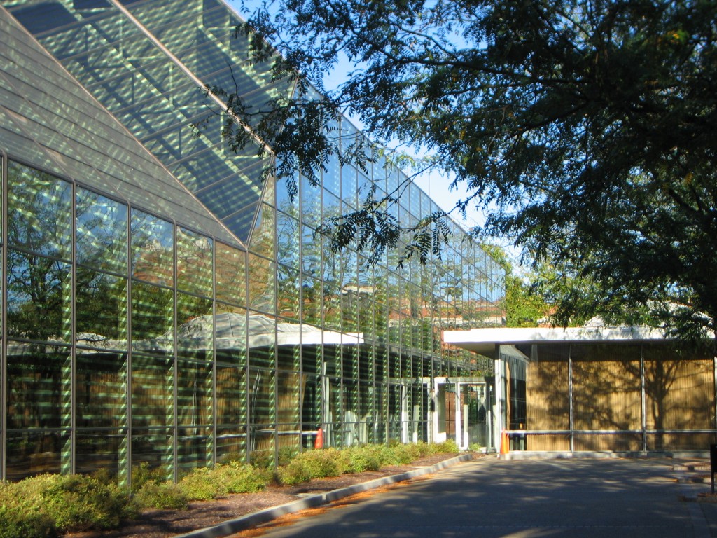 Kevin Roche addition on the left, Eero Saarinen building on the right
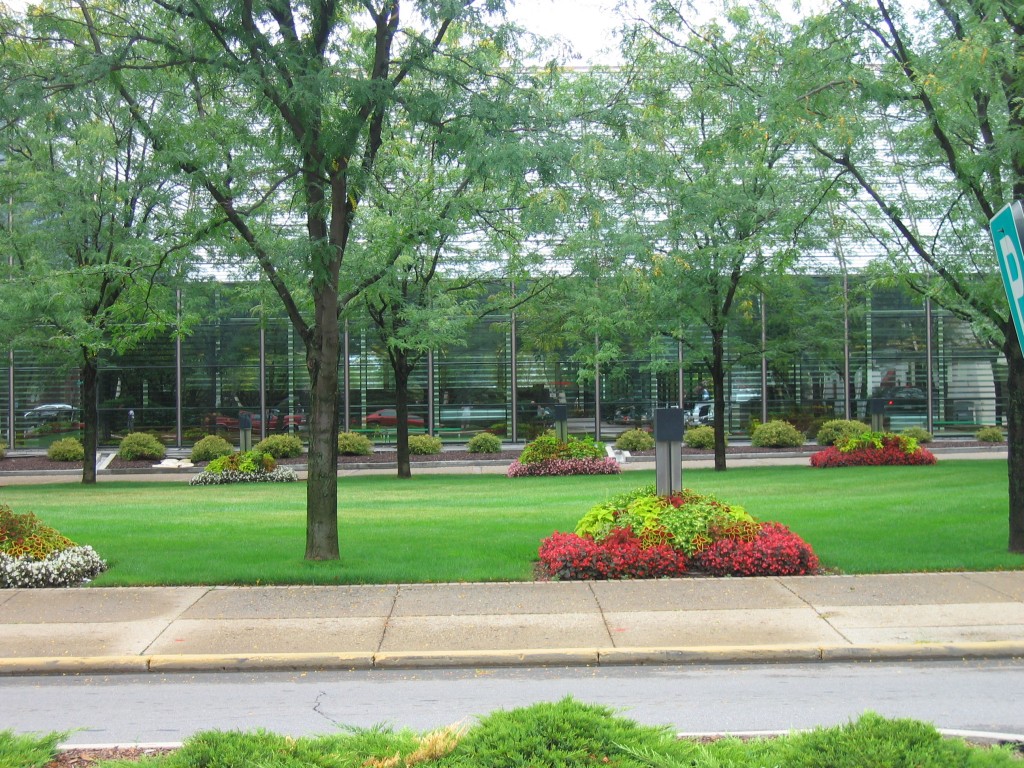 View of Roche addition from 5th Street
(photo by Ricky Berkey)
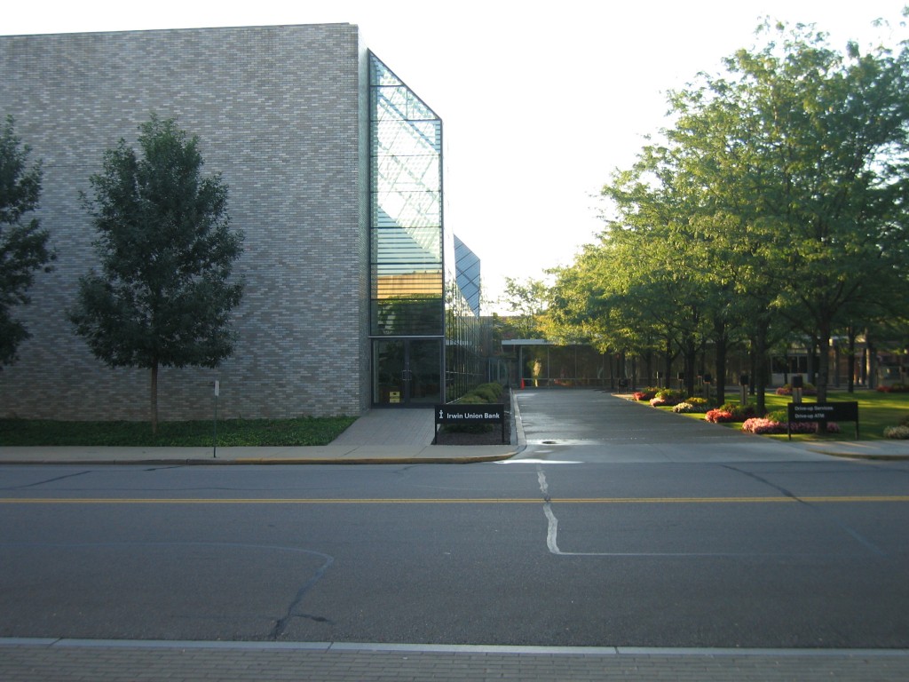 Side view of the Roche addition from the back
(photo by Ricky Berkey)
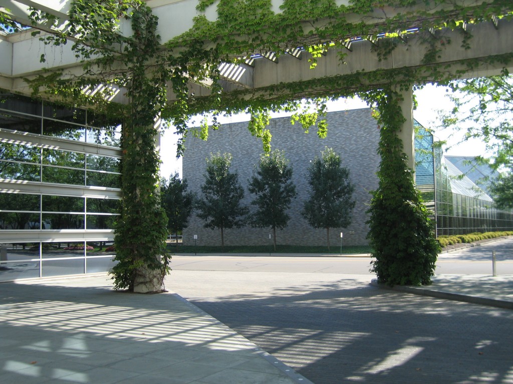 View of Kevin Roche addition from the Cummins HQ which he also designed
(photo by Ricky Berkey)
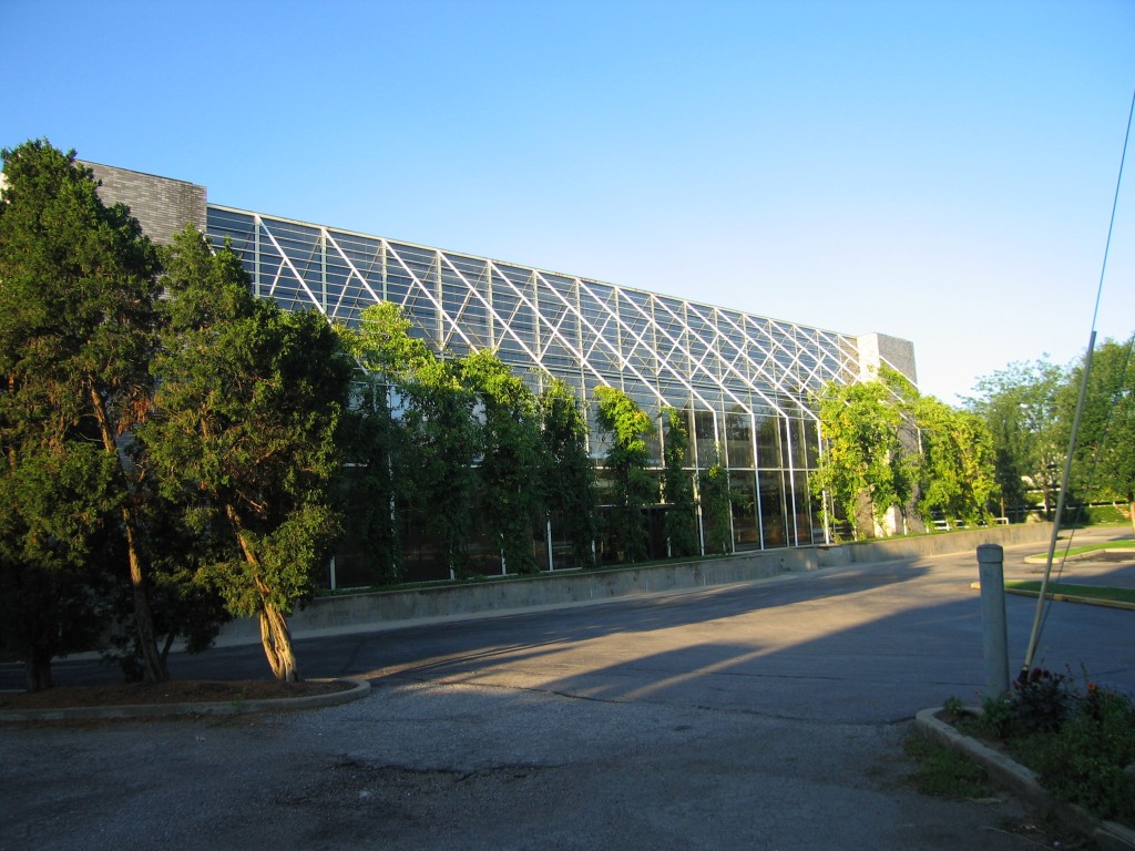 Roche addition, opposite from the arcade side
(photo by Ricky Berkey)
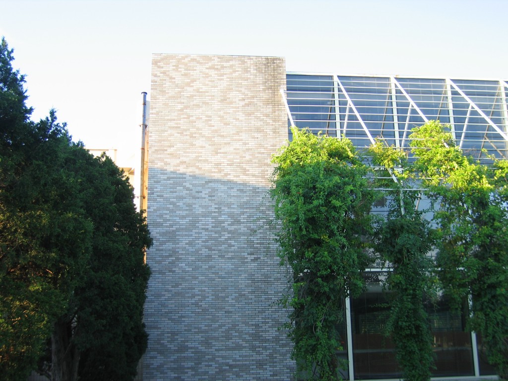 Roche addition, north side
(photo by Ricky Berkey)
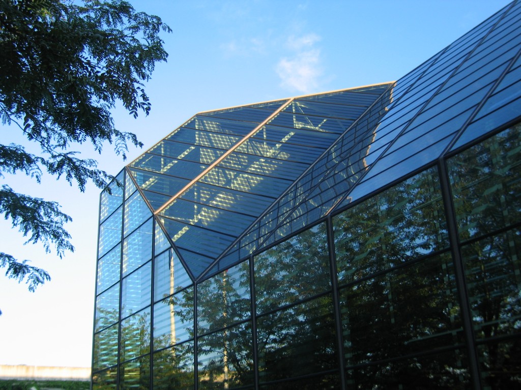 Part of the Kevin Roche arcade
(photo by Ricky Berkey)
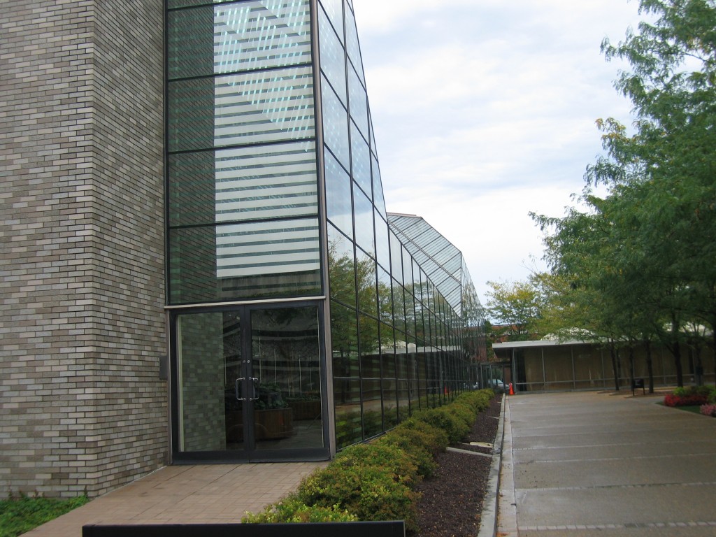 Side view of the Kevin Roche addition
(photo by Ricky Berkey)
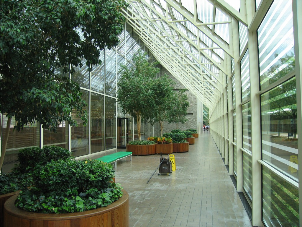 Inside the Kevin Roche arcade
(photo by Ricky Berkey)
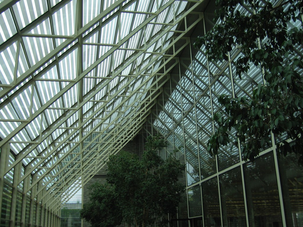 Inside the Roche arcade
(photo by Ricky Berkey)
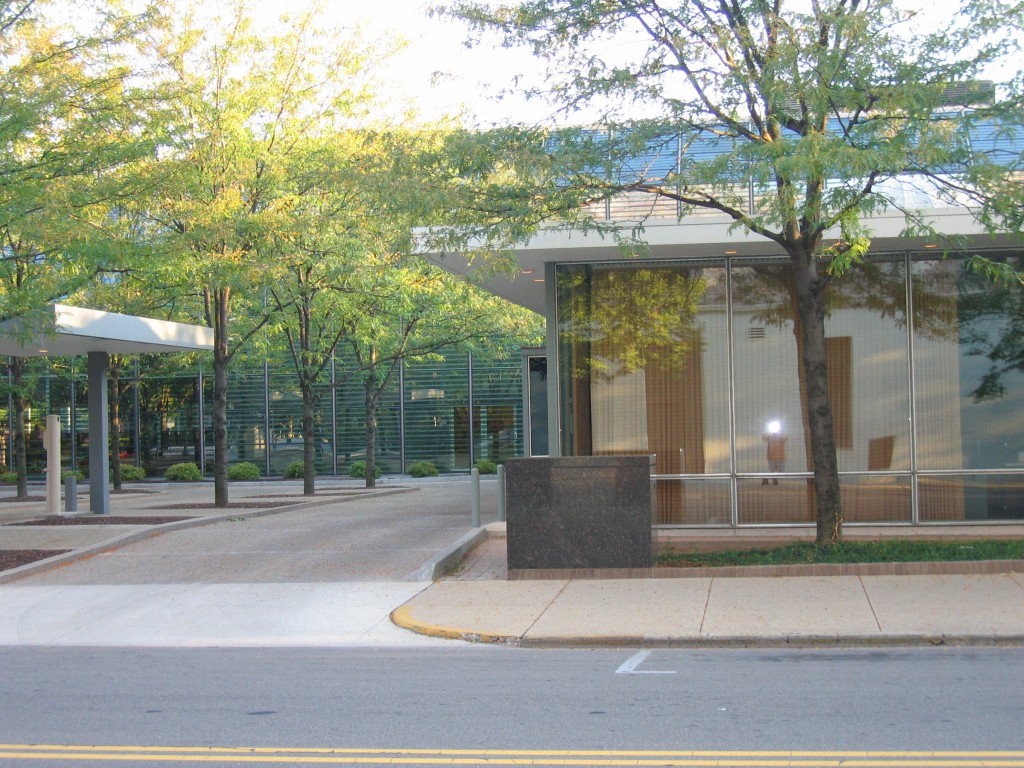 Rear of the original building with drive-thru lanes to the left
(photo by Ricky Berkey)
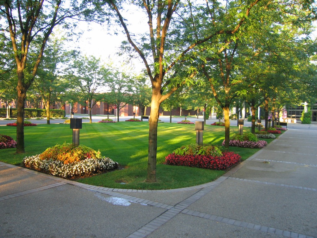 Park like setting behind building, original Dan Kiley landscaping has been significantly modified but they have tried to stay true to the intentions of his design
(photo by Ricky Berkey)
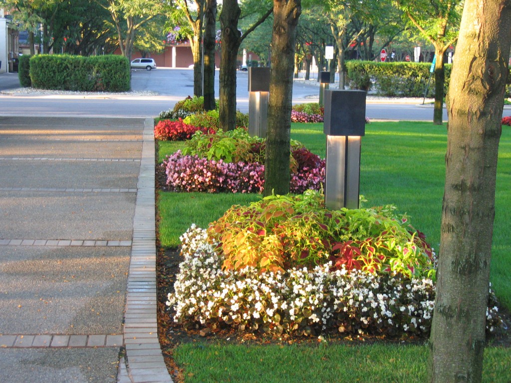 Landscaping along one of the drive-thru lanes
(photo by Ricky Berkey)
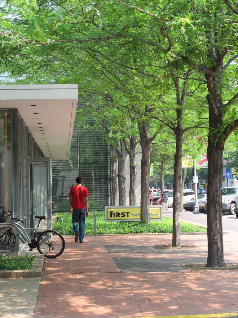 Washington Street side
(photo by Ricky Berkey)
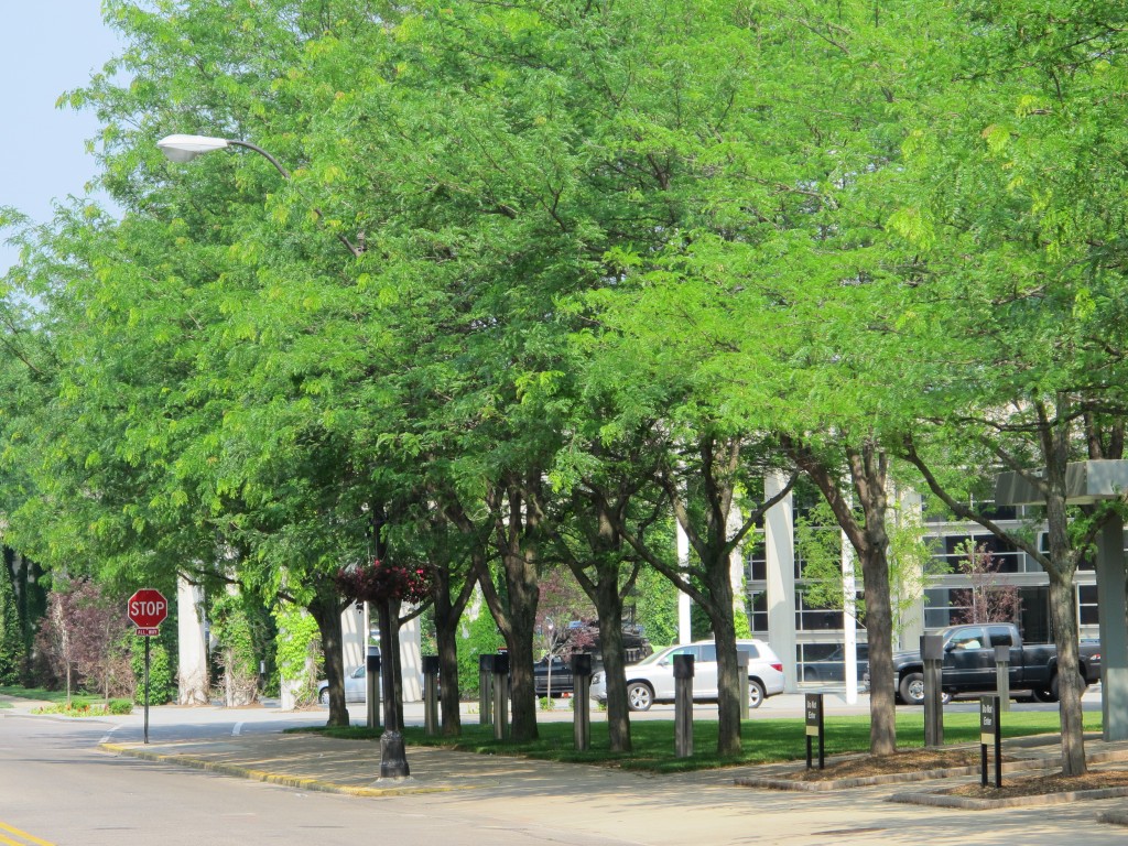 Park-like setting behind building
(photo by Ricky Berkey)
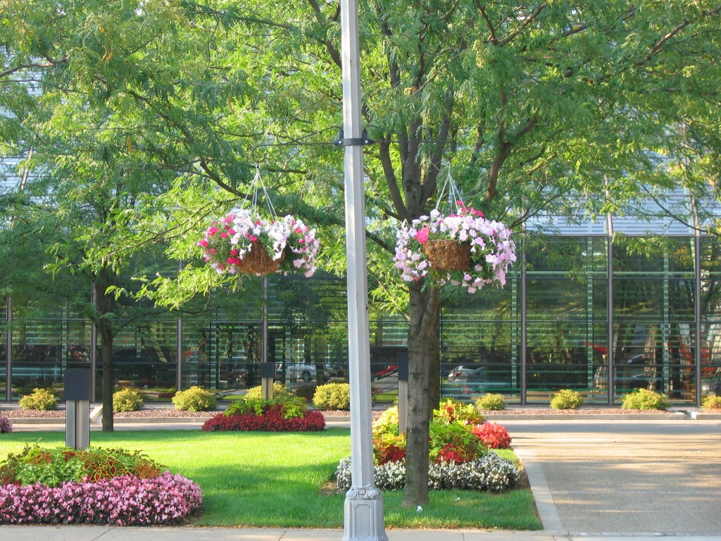 Rear of property, Roche addition in background
(photo by Ricky Berkey)
The Architects
 Eero Saarinen
- Born in Kirkonummi, Finland on August 21st, 1910
- Died September 1st, 1961
- Cranbrook Academy
- Académie de la Grande Chaumière – Paris (1930)
- Yale University (1934)
- AIA Gold Medal Award
Eero Saarinen was a Finnish-American architect famous for taking modernism to different levels. He is most famous for his simple sweeping and arching sculptural shapes which were amazingly done before the era of computer-aided design and drafting had arrived. Unlike many of his contemporary architects, Eero Saarinen never had a particular defining style but insisted on a unique design to reach the architectural solution for each project.
He moved to the United States from Finland with his family in 1923 when he was 13. His father was Eliel Saarinen who had designed the campus at the Cranbrook Academy in Bloomfield Hills, Michigan as well as becoming the head of the Cranbrook’s Art, Design and Architecture School. Eero became a naturalized United States citizen in 1940. He studied sculpture and furniture design at Cranbrook and then went to Paris to study sculpture at the Académie de la Grande Chaumière in Paris, France. He completed his architectural study at Yale University in 1934 and began working with his father who had an architectural practice based out of his home at Cranbrook besides his academic work there.
He worked with his father from 1936-1950 with a wartime stint working for the Office of Strategic Studies (OSS) from 1942-1945. He gained national prominence on his own when he won the 1948 design competition for the Jefferson National Expansion Memorial (the iconic St Louis Gateway Arch).
After his fathers death, he began his own architectural firm in 1950 as Eero Saarinen & Associates. Besides his many buildings, he also designed interiors and furniture, especially well known for his Womb Chair and the Tulip Chair which were icons of the 50’s and still in production today. He had both studied at Cranbrook and taught there briefly where he had become close friends with Charles Eames who was also an architect as well as a furniture designer known for a number of very iconic chair designs. Eames later became a furniture designer associated with Herman Miller while Eero Saarinen designed furniture for Knoll (Florence Knoll was a graduate of Cranbrook). A number of both Charles Eames and Eero Saarinens furniture designs are still in production today.
Eero Saarinen died while undergoing surgery for a very unexpected brain tumor in 1961: he was only 51 and left behind at least 10 projects that were later completed by the Saarinen firm which was taken over by Kevin Roche and John Dinkeloo. Although his popularity as an architect fell out of favor for a few years there has been a recent surge of interest in his designs and many critics have reassessed his work. Saarinen is now considered one of the masters of American 20th Century architecture. Eero Saarinen’s archive material has been donated to the Yale University Library by Kevin Roche.
Selected Eero Saarinen Projects
1940: Kleinhans Music Hall (with Eliel Saarinen) – Buffalo, New York
1940: Crow Island School (with Eliel Saarinen) – Winnetka, Illinois
1948: Womb Chair
1954: Irwin-Union Bank – Columbus, Indiana
1955: Kresge Auditorium (MIT) – Cambridge, Massachussets
1955: General Motors Technical Center – Warren, Michigan
1956: Tulip Chair (part of the “Pedestal” group which included arm and side chairs and tables)
1957: Miller House – Columbus, Indiana
1958 Concordia College (several buildings) – Fort Wayne, Indiana
1959: Yale Hockey Rink – New Haven, Connecticut
1962: Dulles International Airport – Washington D.C.
1962: Bell Labs – Holmdel, New Jersey
1962: TWA Terminal at JFK Airport – NYC
1964: North Christian Church – Columbus Indiana
1965: Gateway Arch – St Louis, Missouri
1965: CBS Building (“Black Rock”) – NYC
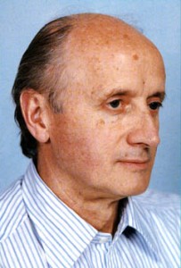 Eamonn Kevin Roche
- Born: June 14, 1922 in Dublin, Ireland.
- National University of Ireland, Dublin (1945)
- Illinois Institute of Technology, Chicago (1949)
After graduation from college, Roche worked with Michael Scott in Ireland and Maxwell Fry in London from 1945-1948 before coming to the USA to study at IIT under Ludwig Mies van der Rohe. He joined Eero Saarinen’s firm in 1950 and within a few years became the Principal Design Associate to Eero Saarinen and worked closely on all Saarinen projects. When Eero Saarinen died in 1961, Roche completed a dozen projects already underway including the St Louis Gateway Arch, the CBS “Black Rock” building, the TWA Flight Terminal, Dulles International Airport and North Christian Church.
In 1966, Roche reorganized as Roche Dinkeloo & Associates along with partner John Dinkeloo and began many projects on their own. Major projects have included the Oakland Museum and the “Pyramids” buildings in Indianapolis. His works have included museums, corporate headquarters, performing arts centers and university buildings.
Other Roche projects in Columbus, Indiana:
- Columbus Post Office(1970)
- Cummins Midrange Engine Plant (1973)
- Cummins Corporate HQ (1983)
- Visitors Center Addition (1995)
- Addition to Cummins Plant One (1998)
- New Scoreboard at Otter Creek Golf Course (2010)
In addition to working with Eero Saarinen on the J. Irwin Miller Home in Columbus in the 50’s he also designed the largely unknown Miller residence in Florida in 1982. After John Dinkeloo died in 1981, Roche continued the practice with other partners but left the firm name the same to honor his long work with Dinkeloo. Roche received the Pritzker Prize for architecture in 1982 and the AIA Gold Medal in 1993. The firm itself won the AIA Firm Award in 1974.
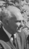 John Gerard Dinkeloo
- Born 1918 in Holland, Michigan
- Died 1981
- University of Michigan (1942)
John Dinkeloo was an engineer as well as an architect and was an expert in construction technology. He started his career at the Chicago office of Skidmore Owings and Merrill before joining Eero Saarinen in 1950.
He worked very closely with Kevin Roche to bring the Roche design ideas to life. In their partnership, Roche was the principal designer and Dinkeloo provided expertise in construction and technology. Their amazing partnership pioneered many new material technologies and construction techniques. Many of their buildings explored environmental techniques years ahead of our current “green” technology trends.
Historic Columbus
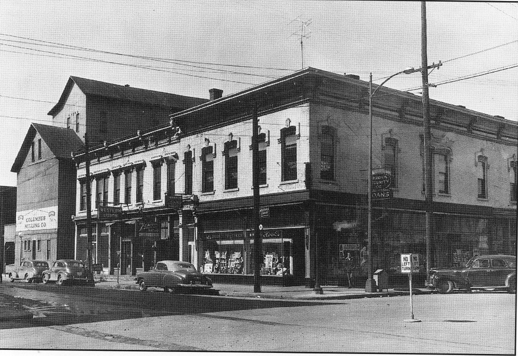 Dramatic transformation of this site at 5th and Washington when Irwin-Union bank was built, Hooks Drug store on the corner with a mill behind it on 5th Street
(photo used pending permission)
Links/References
NHL nomination form: Detailed NHL nomination information for the Irwin-Union Bank
City of Columbus: official City of Columbus website
Columbus Indiana Architectural Archives
Columbus Indiana Architecture Digital Archives: A small portion of the Columbus Indiana Architectural Archives available online from the IUPUI digital library
3D Models of Columbus Architecture Executed in Google SketchUp:
The Republic Newspaper – Columbus, Indiana newspaper
Bartholomew County Public Library
Historic Columbus Website – David Sechrest’s tribute to Columbus History
Historic Columbus Message Board – a companion interactive forum to the David Sechrest historical website
Bartholomew County Historical Society
 Click HERE for a Calendar of Upcoming Events in the Columbus Area.
Click HERE for information about Tours of Columbus Architecture and Design including the Miller House.
 Ricky Berkey
Email me: rickyberkey@gmail.com

Lori, this is a gorgeous home… I was admnriig it just a few weeks ago on that Dwell post. Love the colours and textures and the fact that the spaces are so timeless – which is like every mid 20th century design.Helen