(v12.08.14)
Art, Architecture and Design
This article spotlights a particular building or some other aspect of Columbus design. I welcome your comments, corrections and additions. Please share your experience and perceptions of these uniquely Columbus projects.
 Republic Newspaper Building
- Built – 1971
- Architect – Myron Goldsmith / Skidmore, Owings and Merrill (SOM), Chicago
- AIA Honor Award Winner (1975)
- National Historic Landmark)(2012)
The late sixties and early seventies saw a flurry of activity in downtown Columbus. After years of discussion and planning, a master plan had been developed by Skidmore, Owings and Merrill (SOM) in an attempt to revitalize the downtown area due to changing shopping patterns as well as the deteriorating condition of many buildings in the downtown area. Large areas of land in the downtown area were purchased by the Columbus Redevelopment Commission, deteriorated buildings were cleared and the tracts of land made available for redevelopment. The Redevelopment Commission was formed in 1966 and was the subject of much controversy as buildings and land were obtained, without immediate guarantees of what was to take their place. The use of eminent domain to obtain the necessary redevelopment properties sometimes in the face of extremely unwilling building owners left bitter feelings that lingered for years afterward.
The Republic newspaper, a fixture in Columbus for generations, wanted to be a major part of this development and built a new building to house their editorial department as well as their printing plant. They chose a site directly across from the County Courthouse to be near the seat of power in the community. They wanted to affirm what they saw as their role of a newspaper to be a force of life and growth in the community. Their former location was directly across from the City Hall who would later join them with their own new building on an adjacent corner. The newspaper was first published on April 4th, 1872 and has been owned and published by the Brown family for 5 generations. This building is their 5th home and along with the move they switched from letterpress to the offset printing method. They moved into this new building on July 19th, 1971.
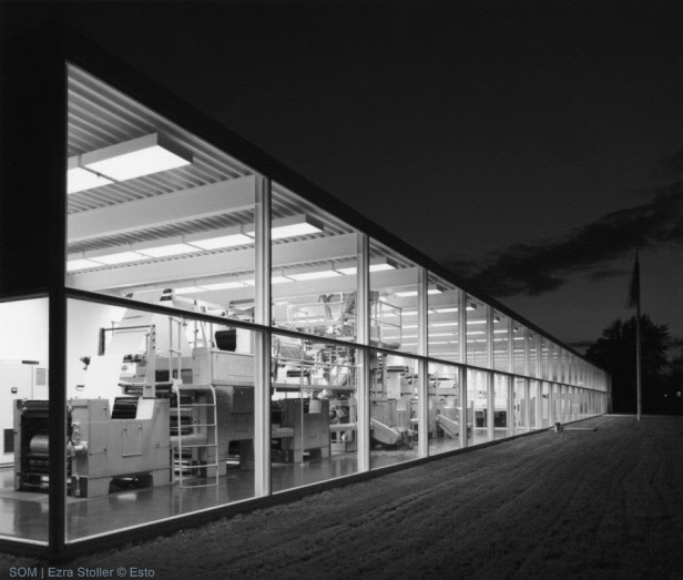
Robert N. Brown who was the owner and publisher at the time described the building as “a panorama of the newspaper from conception to publication as it records the chronicles of the times”. He wanted the building to be an open stage on which the journalism production is continuously visible and lets the public share in the daily drama of newspaper operation. Large open expanses of glass and few inside walls and partitions were important design criteria to allow the public a chance to catch a fleeting glimpse of daily operations as they passed by.
They turned to Myron Goldsmith and the firm of Skidmore, Owings and Merrill to design a building that would be visually striking, open and accessible to the public as well as completely functional to their needs. What they achieved is a very open glass and steel pavilion-like structure that is simple, yet unique and has been able to adapt to the rapidly changing technologies in the newspaper business. The building itself has held up well over the years and still appears fresh and undated.
Myron Goldsmith was a student of Ludwig Mies van der Rohe and worked in his Chicago office early in his architectural career. Mies van der Rohe was one of the pioneers of modern architecture. Goldsmith was also an engineer who studied under noted structural engineer Pier Luigi Nervi. He took advantage of improved technologies in glass and steel to make a perfect “Miesian box”. Miesian architecture is noted for clarity of structure, daring use of glass and steel and honest expression of materials. Glass is used extensively in the Republic building for its ability to accomplish ever-changing images: for its transparency as well as it’s reflecting ability. Modern materials are lighter and stronger; it was easier to accomplish the “less is more” philosophy that was attributed to Mies van der Rohe. Just a few years earlier, glass could not have been made to be used in such large surface areas.
The building along with its parking area covers a full city block. There are 33,419 square feet of space with 10,355 of that in the basement. The slender steel exterior columns not only support the roof but also act as mullions for the ¼’ glass curtain wall system. The structural roof system sits atop the weight-bearing exterior columns spaced 10’8” apart. Internal columns are set on a 32’ x 32’ grid and combined with the 15’ ceilings gives an extremely open spacious feel to the building.
The Republic newspaper company also owns the paper in Franklin, Indiana. Goldsmith did a building for them in 1965 but the Columbus version is much more refined. New glassmaking techniques enabled the use of huge expanses of glass along with extremely slender structural steel columns. From the outside, it provides onlookers a picture window into the world of news and communication. From the inside it provides natural lighting and tremendous views of the surrounding area. The building was kept as a low one-story pavilion so as not to try to overshadow the neighboring Bartholomew County Courthouse yet the distinctive steel and glass structure is highly visible from the street.
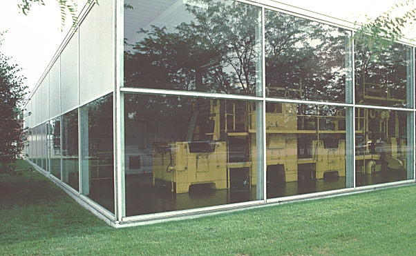
When it opened in 1971, the left side of the building featured a bright yellow offset printing press visible to the street. One portion of the press was so tall that they decided to use an elevated skylight over the press area which provides an interesting exterior relief from the otherwise flat roof. The press was mounted on special pads with footings independent of the buildings foundation to minimize vibration and the press area was acoustically isolated from the rest of the building by ½ inch glass. Those walking or driving by at night could see the presses rolling in the brightly illuminated space as if it were a giant moving sculpture. As their printing business grew to include other newspapers and printing jobs, the presses were removed to a new printing operations building south of Columbus alongside Interstate 65. Those presses are also visible from the front window of that building but are seldom noticed from the adjacent highway. The idea of the visible printing presses reminds me of the Coca-Cola bottling plants that used to position their bottling machines in large front display windows.
The interior is light-filled, open and spacious and by most accounts a pleasurable place to work. Since most of the office cubicles are on public display, Robert N. Brown set strict standards and expected desktops to be clean and orderly, perhaps the opposite of how many people imagine a traditional news room would appear. Cubicle workers with absent-minded accumulations of debris and clutter could well expect to find Mr. Brown at some point hovering over them. Even the press workers were expected to keep the bright yellow presses and the floor underneath spotless. He would not tolerate even a single drop of oil on the floor underneath the printing press area.
With the printing presses removed, interior space was realigned again for maximum efficiency of the process taking place inside the building. The open concept of the interior has been very flexible as new technology has gradually and radically changed how modern newspapers are composed and printed taking full advantage of computers and the internet. The Republic now has an online webpage, an online edition of the paper copy as well as Facebook and Twitter presence. As newspaper readers and subscribers decline The Republic is continually trying to find the best ways to be the voice of the Columbus community.
I highly recommend that you find an excuse to see the interior of the building. They are normally very receptive to visitors. The lobby area features Barcelona chairs (the iconic seating design of Mies van der Rohe). There are displays of artwork throughout the lobbies and conference room areas, much of it related to printing. There are several hanging quilts designed by Elizabeth Barton that were specially commissioned for the building after the printing press was moved based on abstract designs of the Gutenberg press (“Old Press”) and the Republic Printing Center (“New Press”). Actual newspaper images, block type impressions and historic photos have been incorporated into the designs. Norman Ives was commissioned to do a wall mural consisting of 6 mosaic panels consisting of wood block type that was used in the old style of printing assembled into jumbled, abstract patterns. There is also a historical wall documenting the history of the newspaper in Columbus as well as a large map showing a birds-eye view of Columbus in 1886. An architectural sign saved from the top one of the now demolished former newspaper buildings is also on display. The interior views of the County Courthouse and surrounding area through the windows is a work of art in itself.
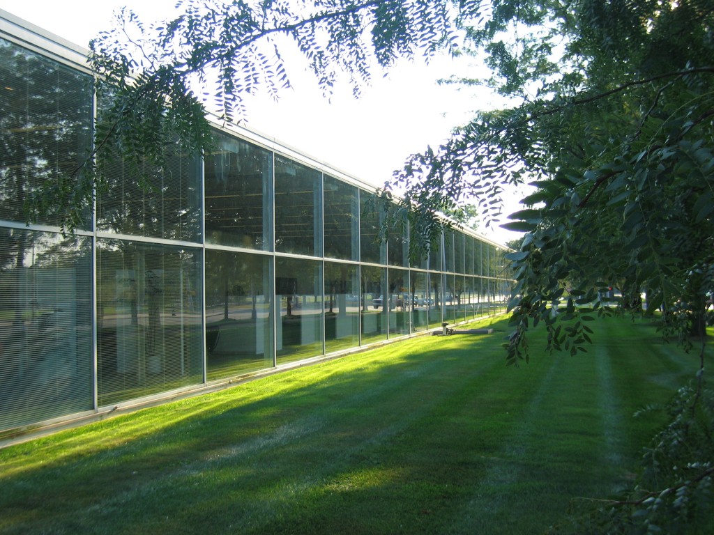 Front facade of building (photo by Ricky Berkey)
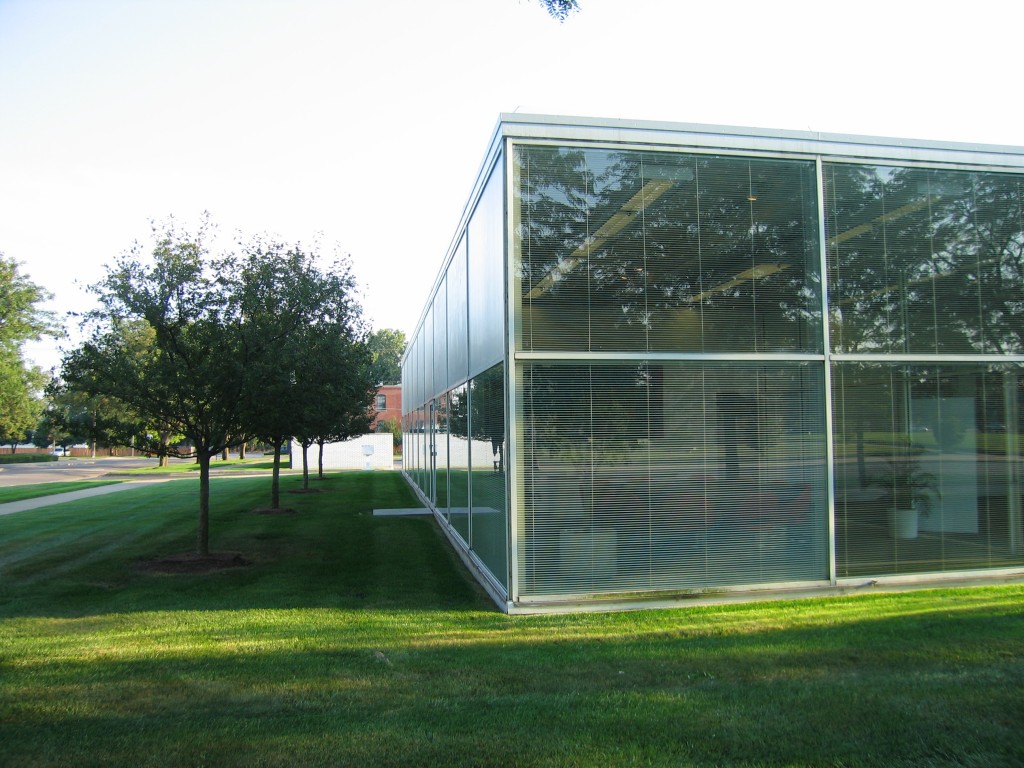 Left front corner of building (photo by Ricky Berkey)
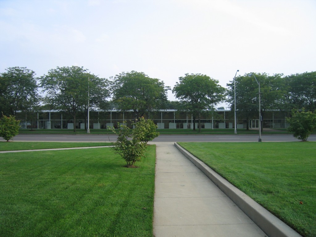 View from the Courthouse lawn (photo by Ricky Berkey)
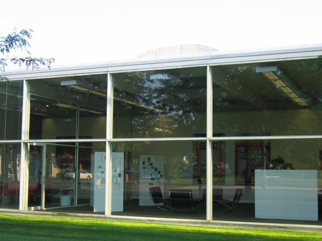 View into the lobby, note the Barcelona chairs (photo by Ricky Berkey)
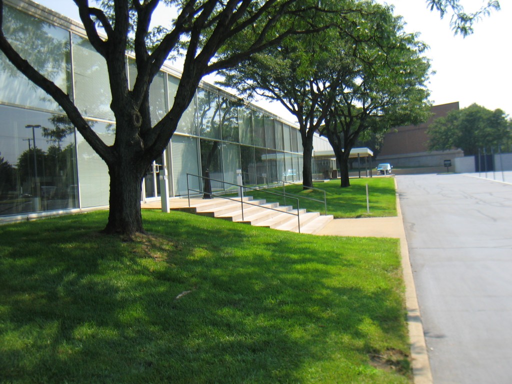 Rear of building (photo by Ricky Berkey)
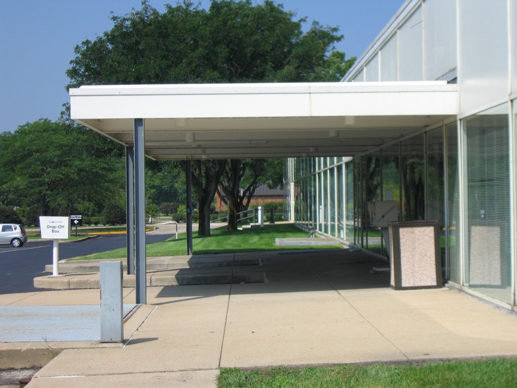 Loading area in the rear (photo by Ricky Berkey)
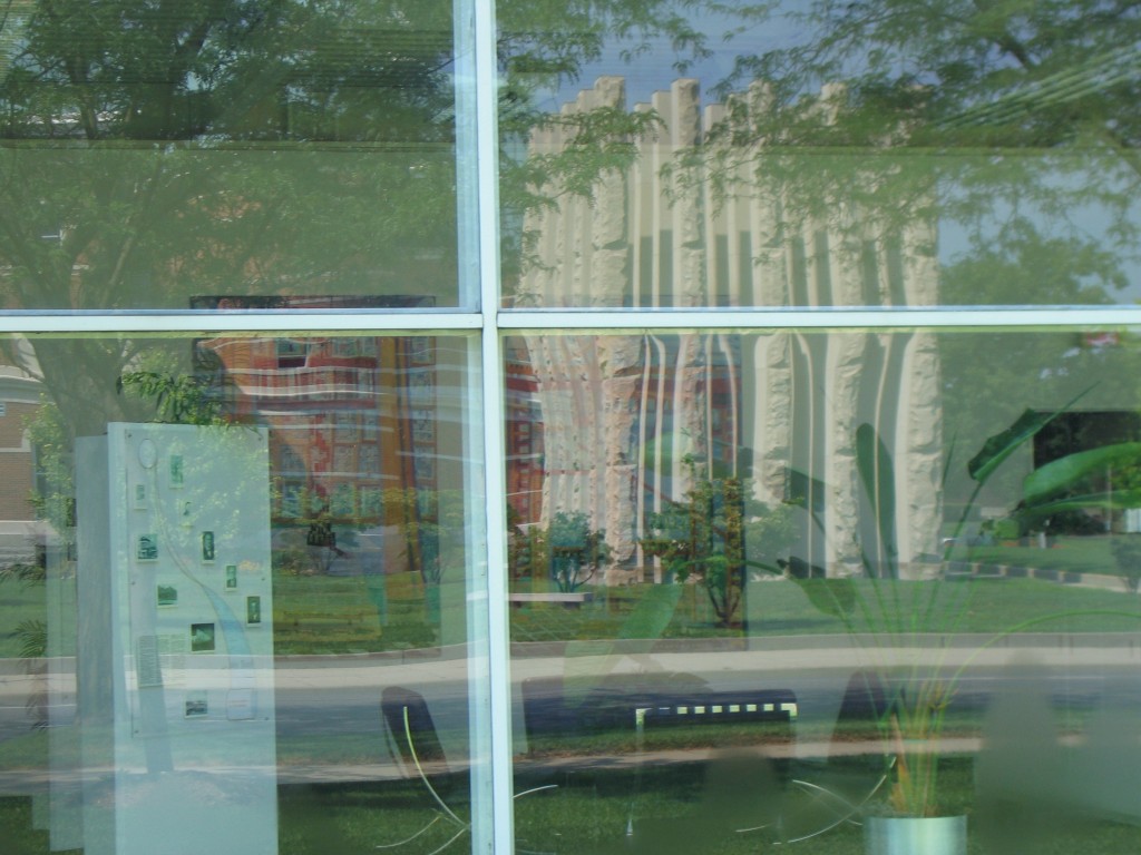 Look into the interior, notice the interesting reflections from across the street (photo by Ricky Berkey)
The Architects
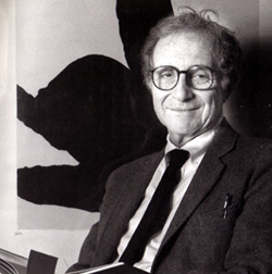 Myron Goldsmith
- Born in Chicago, Illinois on 9/15/1918
- Illinois Institute of Technology (IIT), 1939, 1953
- University of Rome, 1955
- Died in Wilmette, Illinois on 7/15/1996
Myron Goldsmith was a graduate of the Illinois Institute of Technology in Chicago where he was a student of Ludwig Mies van der Rohe. After graduation he was licensed as both an architect and a structural engineer. He served several years in the U.S. Army Corps of Engineers as a bridge designer. Some of his later amazing bridge designs such as the unbuilt but glorious plan for the Ruck-a Chucky bridge must have had their origins with that experience. He has been described as an “architechnologist” because of his unusual expertise and practice of both architecture and structural engineering.
After working for a number of years in the Chicago architecture office of Mies van der Rohe, Goldsmith went to Rome and studied structural engineering with Pier Luigi Nervi. He then joined the San Francisco office of Skidmore, Owings and Merrill (SOM) as Chief Structural Engineer. He later transferred to the Chicago office of SOM, eventually becoming a partner. He also served on the faculty of IIT in Chicago as a Professor of Architecture. Much of his building work was a reflection of the influence of Mies van der Rohe while his notable bridge and sculptured concrete work shows the engineering influences of Pier Luigi Nervi.
 Skidmore, Owings and Merrill (SOM)
SOM is one of the largest architectural firms in the world combining architecture, engineering and urban design. Because they have numerous talented individual architects under their vast umbrella, SOM can take credit for a large number of the major projects of the 20th Century. Since their founding in Chicago in 1936, they have completed over 10,000 projects in more than 50 countries. It won the AIA Firm of the Year award in both 1961 and 1996, the only firm to be awarded the prize twice. They maintain offices in Chicago, New York, San Francisco, Washington D.C., Los Angeles, London, Hong Kong and Sao Paulo.
Started by Louis Skidmore and Nathaniel Owings in 1936, they were joined by John Merrill in 1939. Their firm stresses teamwork as well as individual responsibility amongst its member architects. They maintain a multi-disciplinary workforce that can design and complete nearly any conceivable project. While many architects have resisted being part of the large corporate face of a firm such as SOM, others have appreciated the chance to simply practice their art without having to maintain their own business office. There have been harsh critics of their corporate mentality as well as their faithful adherence to the style of Mies van der Rohe. Frank Lloyd Wright once described Skidmore, Owings and Merrill as “Three Blind Mies”.
Historic Republic Photos
Here are several pictures showing the Republic building when the printing presses were in the front window. These are not my photos and are used here pending official permission. Please do not copy:
Links/References
The Republic: SOM Website Information
The Republic Newspaper: Online
Myron Goldsmith, Interview: Chicago Architects Oral History Project
Skidmore,Owings and Merrill: Official Website
City of Columbus: official City of Columbus website
Columbus Indiana Architectural Archives
Columbus Indiana Architecture Digital Archives: A small portion of the Columbus Indiana Architectural Archives available online from the IUPUI digital library
3D Models of Columbus Architecture Executed in Google SketchUp:
The Republic Newspaper – Columbus, Indiana newspaper
Bartholomew County Public Library
Historic Columbus Website – David Sechrest’s tribute to Columbus History
Historic Columbus Message Board – a companion interactive forum to the David Sechrest historical website
Bartholomew County Historical Society
 Click HERE for a Calendar of Upcoming Events in the Columbus Area.
Click HERE for information about Tours of Columbus Architecture and Design including the Miller House.
 Ricky Berkey
Email me: rickyberkey@gmail.com

